Abstract
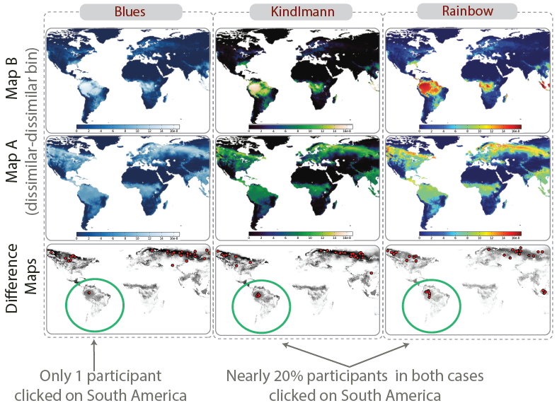
Geographical maps encoded with rainbow color scales are widely used for spatial data analysis in climate science, despite evidence from the visualization literature that they are not perceptually optimal. We present a controlled user study that compares the effect of color scales on performance accuracy for climate-modeling tasks using pairs of continuous geographical maps generated using climatological metrics. For each pair of maps, 39 scientist-observers judged: i) the magnitude of their difference, ii) their degree of spatial similarity, and iii) the region of greatest dissimilarity between them. Besides the rainbow color scale, two other continuous color scales were chosen such that all three of them covaried two dimensions (luminance monotonicity and hue banding), hypothesized to have an impact on visual performance. We also analyzed subjective performance measures, such as user confidence, perceived accuracy, preference, and familiarity in using the different color scales. We found that monotonic luminance scales produced significantly more accurate judgments of magnitude difference but were not superior in spatial comparison tasks, and that hue banding had differential effects based on the task and conditions. Scientists expressed the highest preference and perceived confidence and accuracy with the rainbow, despite its poor performance on the magnitude comparison tasks.
BibTeX
@article{2020-ColorStudy,
 title = {The Effect of Color Scales on Climate Scientists' Objective and Subjective Performance in Spatial Data Analysis Tasks},
 author = {A. Dasgupta AND Jorge Poco AND Bernice Rogowitz AND Kyungsik Han AND E. Bertini AND Claudio T. Silva},
 journal = {IEEE Transactions on Visualization and Computer Graphics},
 year = {2020},
 volume = {26},
 number = {3},
 pages = {1577--1591},
 url = {http://www.visualdslab.com/papers/ColorStudy},
}